Top List
The 10 Most Expensive Logos in the World (Update Mar 2023)
Do you know which are the 11 Most Expensive Logos in the World in 2023?
You may be surprised why logos are so expensive and important. But it is a face of a company. In our modern history logo is a branding procedure of a renowned company. When you will see a logo you will remember the brand and it will also help to raise the sales of any company.
![]()
People do not aware of the cost of making logos. There are so many profitable and expensive logos in the world Some people know the process of making these logos. Do you know about MacDonald? The first food chain in the world. The famous yellow M now spreads everywhere.
The most expensive logos aren’t ever the most apparent. But they usually mirror the sheer size and prosperity of the firms in question.
List of the Most Expensive Logos in the World

To develop and innovate the brand, the company should spend a lot of money to hold a position in the business world. What do you think about the cost of making these expensive logos? There are different prices. Many people think that logo is a simple thing of different colors and shapes.
To maintain their brand identity popular companies invest a lot of money to create an extraordinary logo. It has increased the stock of the company. You know many popular costly brands including Nike, Levi’s, etc. If you want to know very well then should read this article carefully. It will help you to get proper information about expensive brands.
11. The City of Melbourne Logo ($2,40,000)
![]()
A perfect logo always inspires the tourist location and tourists also. So various towns and cities spend a lot of money to make an attractive logo. If the tourist spot is famous, every year it will help to get millions in revenue. Melbourne thinks if they change their logo, it will be profitable for them.
So they came back with an artistic M. Behind creating the Melbourne logo, it is said that a perfect logo can evolve the development of the city. It also gives a trendy and innovative thing. The estimated value of this expensive logo is around $2,40,000. The logo is made by the Sydney Office of Landor Associates. There are different colors and patterns to look beautiful and elegant.
10. City of Belfast Logo($280k)
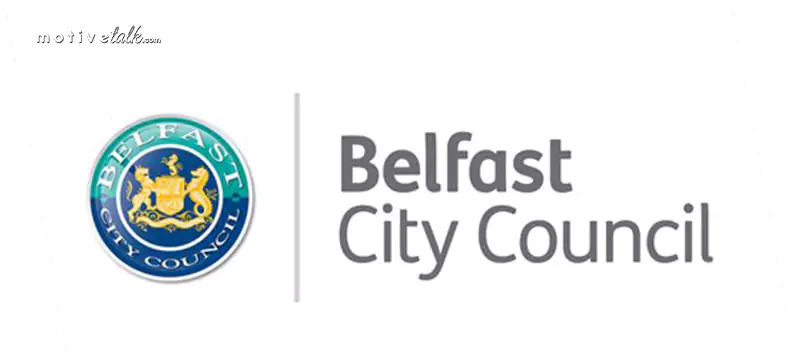
The price of this costly logo is approximately $2,80,000. It is normally odd looking for you, but many cities have their logos. Belfast is the capital of Northern Island. The design of their logo is extraordinary. The heart-shaped logo describes vigorousness, and inclusion and welcomes visitors.
Creating a logo is a good investment for the city. When the logo was first introduced in the year 2017, several people thought making a logo was a waste of money. But this expensive logo is a strong visual symbol for the city. Belfast now updates its logo, it is a Starburst shape now instead of a heart shape.
9. London 2012 Olympics Logo ($645k)
![]()
The London 2012 Olympics logo was one of the most expensive logos in the world. Even it was recorded in the Guinness Book of World Records. The worth value of this logo is roughly $6,45,645. When it first came out it created some controversy but it reflected an iconic image in the athletic society.
The logo was created by brand consultant Wolff Olins. The inventor of this logo was inspired by the cubic art style which is very renowned in London. Olins also designed logos for Uber, Tiktok, and Tesco. The viewers are always reminded of the bold architecture of London. The logo inspired the gaming organization the most and they called it energetic and dynamic.
8. Pepsi Logo Redesign ($1 Million)
![]()
Pepsi is a main competitor of Coca-Cola. It is the million dollars logo on our list. Though the market competition is tough, Pepsi is still an expensive logo in the world. This is a branded company that has changed its logo at various times and comes with new designs. This Pepsi logo was made by Peter Arnell.
The Pepsi logo is unique and it conveys the modern world. The image always shows the updating world. The new logo of the brand is a great success. In this logo, uppercase letters are replaced with lowercase letters. They always try to experiment with their logo.
7. Citibank Logo($1.5 Million)
![]()
This is one of the most expensive logos in the world. The Citibank logo creates history in the world. The recent logo of Citibank is making business around $1.5 million. This bank spreads in more than 19 countries across the world. So they invest a good amount to make a logo.
This bank is updating its logo design and it is a part of the $10 million budget renewal. The Pentagon Company created a simple but effective logo for Citibank. According to the report, Paula Scher primarily had drawn the logo on a napkin. But the company did not accept that. Now they adopted a brand new logo.
6. BBC Logo ($1.8 Million)
This is a popular logo and English speakers mainly recognize this expensive logo. Three white capital letters are located out against three black squares. BBC is an enormous broadcasting network and it first designed its logo in the year 1958. The estimated value of this logo is $1,800,000.
But the recent logo has been used since 1997. Recently the company update its logo but viewers say it is almost the same. Several customers tell that the company does not want to spend so much money on their design.
The management sticks to their decision. There is simplicity in the symbol that tempts the viewers and it is the identity of the brand. The black and white logo always reflects a mark on your mind.
5. BPAY Logo – Australian payment system ($7 Million)

The Australian payment system, BPAY, spent $7 million on a logo redesign in 2011. The new logo featured a simplified and modernized version of its previous design.
The BPAY logo features a combination of graphical elements that create a unique and modern representation. The logo consists of the word “BPAY” written in uppercase letters. The font used is typically a clean, sans-serif typeface, with slightly rounded edges for a contemporary look.
Overall, the BPAY logo design aims to convey a sense of trust, efficiency, and modernity in the realm of online payments. It is a recognizable symbol associated with secure and convenient payment transactions for customers across Australia.
4. ANZ Logo – Australian and New Zealand Banking ($15 Million)
![]()
ANZ logo is the super expensive logo in the world. ANZ is a result of the merging of the two renowned companies. The price value of this multi-million company is around $15 million. The joined forces of Australian and New Zealand Banking Corporations need a perfect logo.
Their recent image is fresh and energetic. It is a mixture of fun and simplicity. The blue color conveys a clear shade of trust. “Re”, the creator of this artistic logo took 18 months to execute it. The image which is used in the logo looks like a person. It is a deliberate attempt of the company to choose a human-centric logo. The image is effective all over the world.
The Top 3 Most Expensive Logos are below
3. Posten Norge Rebrand ($55 Million)
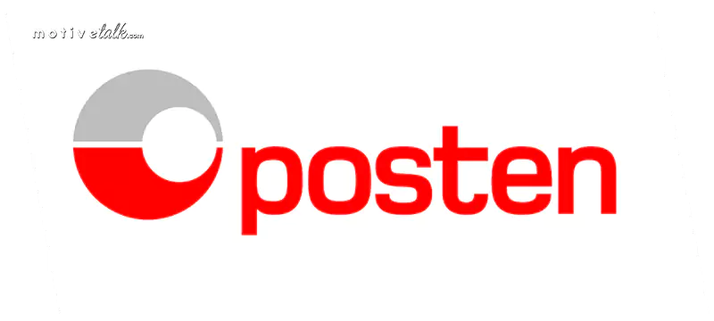
The estimated price of this expensive logo is roughly $55 million. It is the most extremely well-known and costly logo people have ever seen. This company serves postal services in Norway. The best-known company innovates its logo with a new style in the year 2008.
To rebrand the image the price which spends is 300 million Norwegian Korner and several developments occur when the company is rebranding itself. The image is very clear and simple. Even if there are lowercase words are used.
The log is undoubtedly a global appeal. Before many people were surprised to know about the cost of the logo, but now the logo enhances the awareness of the company.
2. Accenture Logo ($100 Million)
![]()
Like several reputed brand logos, Accenture’s logo conveys simplicity and clearness. This expensive logo cost $100 million and the uppercase letters indicate the development of the company. Do you see the arrow image on the top of the T? The symbol is created by Landor Associates.
The company has changed its brand name from Andersen consulting. The brand-new logo shows the company’s intention about developing our future. It also highlights the innovative technology of this organization.
1. British Petroleum Logo ($210 Million)
![]()
This logo is one of the most exclusive and costly logos around the globe. This recognizable and expensive logo of British Petroleum always intends to convert the logo of the Petroleum company. When people are concerned about fossil fuels, British Petroleum wanted to develop individuality as an environmentally-focused and inventive brand.
The brand-new logo, which looks like a green and yellow flower was built by again famous Landor Associates. The worth value of this costly logo is $210 million. According to the branding company, the “Helios” mark signifies the modification of the association and the commitment to following more natural forms of power.
Conclusion The Most Expensive Logos
If you will think that you know the exact amount of all expensive logos, you may be wrong. Many companies do not expose properly the exact value of their logo. We may give in this article a near detail about the cost of making the image. You can see in the list how much money spend to create a perfect logo.
That is why they are so much costly. Many companies like Accenture, and British Petroleum didn’t just expend for a new logo, they also paid for all the support, marketing recommendation, and branding expertise.
The branded companies are required entirely transform their vision. The value of a unique logo can quickly expand. It is blended with the outcome of new brand approaches.

There are various imprinting agencies and design companies with important lineage and backgrounds in the logo design job that can usually charge more. The company renowned for creating some of the world’s most expensive logos is Landor Associates.
Several expensive brand logos mentioned above article might appear moderately simplistic at first glimpse, and many people are surprised that any company would pay so much for branding.
Topic Summary
Here is a quick list of The 11 Most Expensive Logos in the World.
- British Petroleum Logo
- Accenture Logo
- Posten Norge Rebrand
- ANZ Logo – Australian and New Zealand Banking
- BPAY
- BBC Logo
- Citibank Logo
- Pepsi Logo Redesign
- London 2012 Olympics Logo
- City of Belfast Logo
- The City of Melbourne Logo
You may also read

How to View Facebook Story Anonymously? 5 Proven Tips to Stay Hidden

Who is Kara Leigh Dimon? Daughter of American Inspiring Billionaire Businessman (Update: Feb 2024)

Alissa Walsh’s Story of Faith and Family in Just 10 Minutes

Who is Laura Bargatze? Wife of Famous Comedian Nate Bargatze (2024)

Into the Life of Alabama Beauty Queen, Margie Washichek: First Wife of Great Singer Jimmy Buffett

Who is Nedra Stern? Unraveling Story of Lisa Kudrow’s Mother in 10 Minutes

Exploring the Life of Ilaria Gomez and the Dynamic Vardalos-Gomez Family

Discovering Jaymes Foster: The Harmony and Impact in her Musical Journey
-

 Who is2 years ago
Who Is Fauzia Mubarak Ali? Famous Cat Stevens Wife & Their Children (Update: Jan 2024)
-
 Comics3 years ago
Best Shrek Quotes About Life From The Shrek Series
-

 Miscellaneous4 years ago
Lone Wolf Quotes – That Will Trigger Your Soul and Mind
-

 Miscellaneous3 years ago
Warrior Quotes – That Will Make You More Stronger
-
 Miscellaneous3 years ago
Top 27 Letterkenny Quotes – That Will Make Anyone Laugh
-
 Super Hero4 years ago
Captain America Quotes – All Are Ultimate Leadership Quotes
-

 Who is2 years ago
King Yahweh: Unveil Exclusive & Secret Fact About The Mosaic Leader in This Digital Age
-

 Politicians4 years ago
Most Powerful Vladimir Putin Quotes – That Will Blow Your Mind